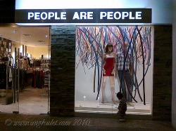
From trendy to tacky, People are People has been losing it's patrons because of it's lack of identity and branding strategy. From the logo itself, we can see its inconsistency-- the font is the same but the color keeps changing from black, to purple, to orange depending on the which branch one goes to. Once being at the level of Zara and Mango, it has lost its touch because of the brand's indecisiveness as to which target market they are trying to appeal to.
 RSS Feed